
Logo definition:
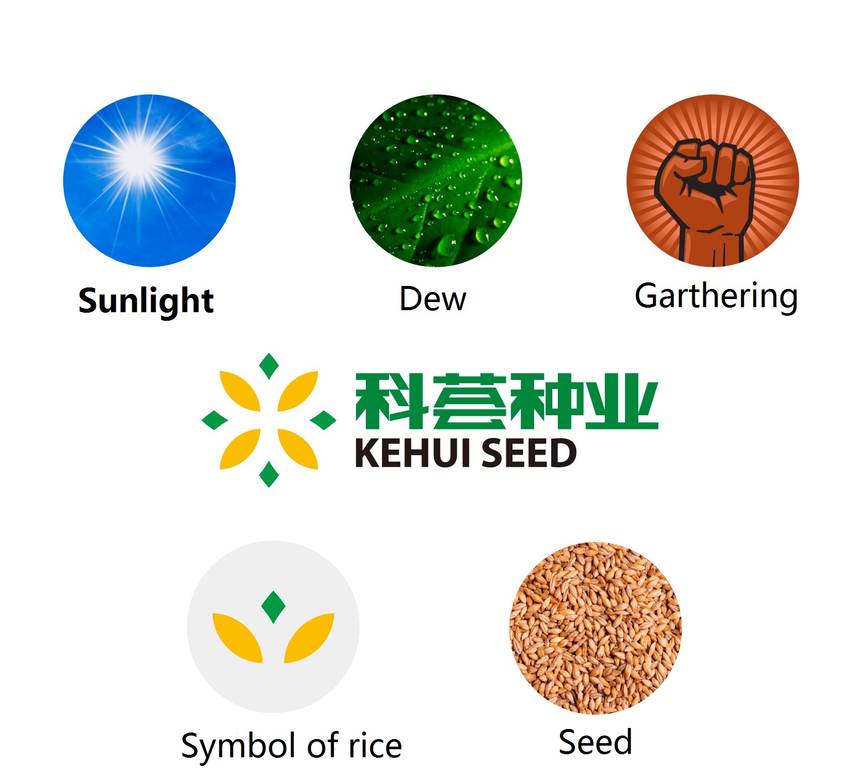
Presented in a radial style, visually the logo is varied and full of modern technical sense. In the base of the shape of rice, it derives more meanings: the redial form represents sunlight; the green spots represent dew which is the essential element of the growth of plant; the yellow kernels represent seed; centripetal form of the logo contains the meaning of gathering.
As a whole, the logo full of modern technical sense. With green and orange color, it is not monotonous. Green color represents life force and orange color represents maturity.